Friday, March 7, 2014
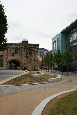
De Montfort University Business School Leicester

I’m currently about half-way through Owen Hatherley’s excellent, “A guide to the new ruins of Great Britain.” At some point, I might write more about it, but given my recent lack of blog activity, it’s perhaps unlikely. The book picks up on a number of issues that have been nagging me about recent regeneration projects; fills them out, gives some historical perspective, adds some critical analysis, and then takes the piss.
As I read the book, it was schemes like the new, De Montfort University Business School, that sprang to mind. Owen describes how many recent buildings have much in common with the “Googie” architecture of 1950’s America; burger joints and giant advertising hoardings, designed to catch the eye of speeding motorists.

With it’s “look at me” turquoise cladding, jauntily angled towards the ring-road vista, this building definitely fits this description. Not wishing to linger too long on the architecture, I find the building slightly tacky and overbearing, particularly given it’s location in Leicester’s historic, Roman heart. While I don’t entirely dislike the plastic-Ikea styling, I resent the way it towers over the nearby Magazine, a solitary vestige of Leicester’s pre ring-road old town.


Naturally, I’m more interested in the landscape treatment and public realm design. Prior to visiting, I’d actually heard some positive comments about the scheme and the quality of finish. Unfortunately, I found it to be a jumbled mess of generic materials, that have little relationship with anything other than the new building. Dark granite pavers, light granite cobbles, buff bound gravel, polished stainless steel, black powder-coated steel, matt grey steel, grass, semi-mature trees, timber, rendered brick, concrete copings, granite blocks and pre-cast concrete, all scattered along a series of unrelated axis and geometries.


I would imagine that there was some sort of design statement which explained how the materials were inspired by the dirty sandstone of the magazine, unfortunately it would be empty post-rationalisation for the use of the same old materials palette and the simplest, polyline-from -the corner-of-the-building, design approach. Yes I’ve seen the same materials used elsewhere, by the same designers and on more than one occasion.
It’s funny, but I think there are clear parallels between recent public realm designs, with overly busy, multi-materialled treatments and much of the post-millennium architecture of Britain. I’m not sure if I’ve ever seen a provincial arts centre built in the last 5 years that didn’t feature a riot of cladding treatments. However, I’ve not seen anyone comment on how this fad has spread to the world of landscape architecture.


Returning to this particular scheme, I’m also irritated by the half-arsed detailing that is prevalent. Yes, it can be a bugger to get this stuff right, but all you need is someone who cares enough to see that service access’ doesn’t interrupt the design intent.

I REALLY hate the way, granite blocks meet a chamfered precast concrete block. Perhaps I’m being harsh on the designers involved and maybe this detailing is the result of some contractor led, design and build/value engineered approach. I really, really hope so.


Perhaps the most successful element of the scheme, is the area around the old Arts’ School building, leading up to the old Gateway College (yes I went there). The palette of materials seems much more restrained, with a formal lawn and some fine mature trees. However, I was a little dismayed that the treatment ends so abruptly before reaching the Gateway building.


Similarly, the paving doesn’t extend right up to the adjacent Newark House Museum (unsurprisingly the only bit of the area not part of the mighty, De Mont). In fact, for some reason we actually have a guard rail impeding access to this entrance?!?


Finally, the scheme also includes a ubiquitous, courtyard, come-amphitheatre, come performance space, complete with some tasteful planting. It’s quite pleasant.


Okay, okay, have I been too harsh on this scheme? In isolation, its not so awful. Im really trying hard not to be the blogging equivalent of Statler & Waldorf. Certainly, it’s much better than what used to be there, and I daresay that students will really use all that space to congregate, drop flyers and enjoy the odd hand rolled cigarette. The materials are at least of good quality, and for a certain sort of person, the scheme does give a certain veneer of urban sophistication. I just wish it was better.
Perhaps, given the inevitable quiet time ahead, it would be a good idea for us all to reflect and what actually makes a good public space and how successful the recent glut of schemes have actually been. Or maybe we should step away from ‘statement’ schemes, be they architecture or landscape architecture, and get back to improving the quality of our streets, homes and public amenities.
Subscribe to:
Post Comments (Atom)

No comments:
Post a Comment